How to Style a Console Table Like You Mean It
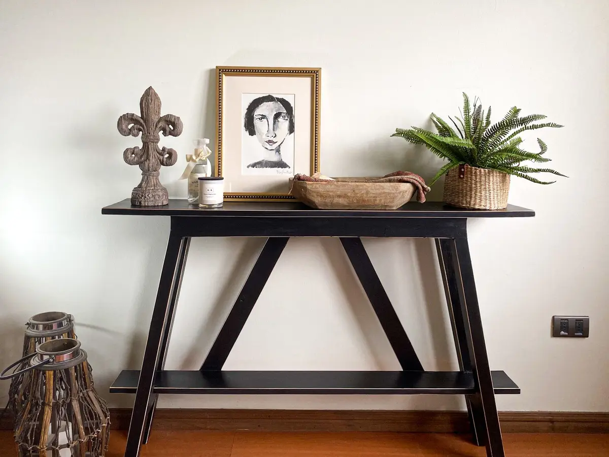
A styled console table needs a base layer (usually a table lamp or tall object), a supporting cast of smaller items at varying heights, and breathing room—aim for odd numbers and leave at least a third of the surface empty. The real work is knowing what to leave out, not what to put in.
- Difficulty
- Beginner
- Time
- 1-2 Hours
- Cost
- $0 — $200
- Tools
- None required
- Permit required
- No
- Contractor recommended
- No
- You will need
- Table lamp with shade (18-28 inches tall), Tall vase, sculptural object, or art print, Decorative candle or secondary focal point, 2-3 books with coordinating covers, Small ceramic dish, box, or tray, Optional: framed photo, potted plant, or shallow tray, Soft brush or microfiber cloth for dusting, Optional: 3-5 backup objects to rotate seasonally
Materials
- 1 Table lamp with shade (ceramic, brass, or wood base) (Choose height proportional to your console—typically 18-28 inches. Shade should be linen, cotton, or ceramic. Look for something you'll actually use.) — $40 — $120
- 1 Tall vase or sculptural object (ceramic, glass, or wood) (Should be roughly lamp height or slightly shorter. Clear glass, solid ceramic, or simple form work best. Avoid highly ornate pieces unless your table is equally simple.) — $15 — $60
- 1 Decorative candle (pillar, tapered, or jar style) (Scent is optional; visual presence is essential. Neutral colors coordinate better than bright hues. Look for one in a material that complements your lamp base.) — $8 — $25
- 2-3 Books (hardcover, whatever interests you) (Stack them horizontally or stand them vertically. Color and cover matter—aim for spines that work together visually. These can be books you actually read.) — $0 — $30
- 1 Small ceramic or decorative dish or box (Functional or purely decorative. Shallow dish works better than a tall box for console proportions. Look for something in a neutral tone or subtle pattern.) — $10 — $40
- 1 (optional) Framed photograph or small art print (Stand it leaning against the wall rather than hanging it. Frame color should echo your lamp base or table finish. Keep it small—5x7 inches or smaller.) — $10 — $30
- 1 (optional) Small potted plant or fresh flowers (Low-maintenance plants work better than fussy ones. Pothos, snake plant, or succulent. Flowers should be in a vase that matches your color story.) — $8 — $35
- 1 (optional) Shallow decorative tray (Brass, wood, ceramic, or woven. Acts as a catchall for keys and small items while defining a functional zone. Roughly 8-12 inches long.) — $15 — $50
Step by step
Know Your Table First
Before you bring anything to the console, look at what you already have. The table's color, material, and shape will set the tone for everything else. A dark wood table reads different than glass or marble or painted wood. A narrow console demands vertical thinking; a wide shallow one can spread out more. You're not changing the table—you're understanding its personality first. This matters because what works on walnut doesn't always work on white oak or painted white. If your table is plain, you have more freedom. If it has texture or a strong color, you're already halfway done before you style it.
Tip: Photograph your empty table in the actual room light you have—artificial, natural morning, or evening. Your phone sees color differently than you do, and it'll guide your material choices.Pick Your Anchor Lamp
Every styled console needs a vertical element, and a table lamp is the most practical choice. It solves two problems at once: it gives you height, and it's actually useful. Pick a lamp that's roughly one-third the height of your console table, or between 18 and 28 inches tall for most standards. The base matters more than you think—a ceramic base, a brass base, or even a wooden base all read differently. The shade should be proportional to the base. A massive linen shade on a skinny brass base looks wrong. Lamp height should be tall enough that the bottom of the shade is roughly eye level when you're standing near the table. This is your anchor. Everything else orbits this.
Tip: A lamp you actually use is better than a decorative object. You'll touch it more often, and it'll feel less staged.Add Height and Depth
Now that you have your anchor in the center or off-center, add one more piece that's taller than the lamp or roughly the same height. This could be a vase, a small sculptural piece, a framed print leaning against the wall, or even a tall plant. It doesn't have to be expensive—a clear glass vase or a simple ceramic pitcher works. The point is creating a visual cluster of varied heights, not a single focal point. Position this piece so it doesn't hide the lamp; instead, it should sit beside it or slightly behind. This is where you decide if the lamp goes center or off to one side. Off-center often feels less formal and more collected.
Tip: Lean a framed print or artwork directly against the wall behind the console instead of hanging it—it feels more temporary and flexible, like you might change it next week.Fill the Middle Layer
Now place your supporting cast: small books, a candle, a decorative box, a small framed photo, or a ceramic piece. These should be noticeably smaller than your lamp and anchor object. Use odd numbers—three or five small items, not four or six. Arrange them in a loose triangular shape, not a straight line. If you're working with a narrow console, you might only fit three items total. On a wider surface, five to seven small objects work without feeling crowded. Leave gaps between items. The space between objects is as important as the objects themselves. Don't push everything to the center or the back; let some pieces live toward the front edge of the table.
Tip: Group items by rough color family—don't scatter a red candle, a blue book, and a green vase with no connection between them. Let similar tones sit near each other.Embrace the Breathing Room
The edge of your console, the part closest to the room, should be mostly empty. This serves two practical purposes: it keeps the table from looking overcrowded, and it leaves room for the things that actually live there—keys, mail, a phone, a small tray. Visually, it creates a sense of breathing room that prevents the whole arrangement from feeling fussy. Aim to leave at least a third to half of the table surface uncovered. If every inch is decorated, it reads as a display case, not a functional piece of furniture. The best console tables look like someone set down a few intentional things and stopped.
Tip: Use a shallow decorative tray or dish near the front to catch the functional clutter—it's practical and it defines a zone without adding visual noise.Mix Textures and Finishes
Now step back and look at what you've built. You want a mix of materials and finishes—not all shiny, not all matte. If your lamp has a linen shade, your anchor piece could be ceramic or glass or metal. If you have a wood table, add something that's not wood: glass, metal, ceramic. Material variety makes the eye move around the arrangement instead of settling in one spot. A brass candle next to a ceramic vase next to a wooden box next to a woven object creates more interest than five ceramic pieces in a row. This is true for color too—if your table is dark, you want some lighter pieces. If your table is light, bring in some darker tones. Not dark and light fighting each other, but a clear choice about where the contrast lives.
Tip: Matte finishes and shiny finishes mixed together feel intentional; all one or the other feels either too formal or too flat.Consider the Backdrop
A console table is usually a shallow piece sitting against a wall, so the wall behind it matters a lot. If your wall is bare, your styled console can stand a little taller and bolder—the negative space of the wall is your ally. If your wall already has texture, wallpaper, or a large piece of art, dial back the height and scale of your console styling. A tall arrangement can compete with a striking wall and lose. A low, compact arrangement complements a bold wall. If you're hanging art above the console, leave space between the top of your tallest styled object and the art—at least 4 to 6 inches. This keeps everything from bunching up. The table, the styled objects, and the wall should form one coherent zone, not three separate conversations.
Tip: Measure the distance from the top of your arrangement to eye level when standing near the console; if art goes above, it should start about 6 inches higher.Keep It Fresh Monthly
A styled console that never changes starts to look staged and permanent. Every month or even every season, swap out one object—rotate in a different candle, swap a vase for a small planter, change the book, replace one framed photo with another. This keeps the table feeling alive and collected rather than frozen. It also gives you permission to not get everything perfect from day one. You're building a rotation, not a permanent installation. Small changes are easier than redesigning the whole thing, and they keep the eye interested without requiring you to obsess over the styling.
Tip: Keep a small basket nearby with backup objects—extra candles, small vases, books you might swap in—so you can rotate without having to hunt.Maintain Weekly Upkeep
Styling only works if the table looks clean and intentional. Dust around your objects weekly—use a soft brush to dust between items without moving them. Wipe down the table surface where it's visible. A dusty console table with nice objects looks neglected, not curated. If you're using candles, light them occasionally so they don't look staged. If you have plants or flowers, keep them fresh—a wilted arrangement reads as sad, not rustic. The difference between a styled console and a haphazard pile is maintenance. Fifteen minutes every two weeks keeps it looking deliberate.
Tip: Use a dry microfiber cloth for dusting—it won't leave streaks or move small objects around.Adjust for Real Life
After a week of living with your styled console, step back and really look at it. Does it work with how you actually use the table? Are you moving things every time you set down your keys? Is the arrangement so precious that you're afraid to use it? A console that looks good but can't function isn't styling—it's performance. Move pieces if you need to. If your lamp is in the way, relocate it. If five objects feel crowded, remove one. If the whole thing feels too bare, add something small. Styling is a conversation with how you actually live, not a decoration imposed on your space. The best console tables look good and work harder.
Tip: If you find yourself constantly pushing things aside to use the table, your styling is too ambitious for your real life—simplify.
Questions people ask
Do all the objects have to match or be from the same collection?
No. In fact, matching sets often look too obvious and precious. Mix materials, finishes, and even styles—the cohesion comes from color palette and scale, not matching. A ceramic vase, a brass candle, and a wooden box can live together beautifully if they share a neutral color family.
What if I don't have a lamp that fits?
A lamp is ideal but not essential. You can anchor the console with a tall vase, a stack of books, a framed print leaning against the wall, or even a plant. You'll lose the functional benefit of a light source, but the styling will still work—just make sure whatever you choose is roughly one-third the table height.
Is it okay to put real plants or fresh flowers on the console?
Absolutely. Just commit to maintaining them—water on schedule, deadhead flowers, rotate plants if they get leggy from lack of light. A healthy plant looks vibrant and alive; a drooping plant looks sad and neglected. If you're not willing to care for it, use a faux plant or skip plants entirely.
What colors work best for styling a console?
Whatever colors are already in your room. Neutral (white, cream, gray, black, wood tones) gives you the most flexibility. If you have an accent color in your room—a blue sofa, a warm rug—echo that in your console styling. Don't introduce a brand-new color that doesn't live anywhere else in the space.
How do I know if I'm overdoing it or underdoing it?
Step back and look for white space. If you can see your table surface and there's air between objects, you're probably in balance. If the table is completely full and you can't see any of the base, you've overdone it. When in doubt, remove one object and see if it improves the view. You can always add something back later.
Variations
- Styling a console in a narrow hallway: Keep height low (under 20 inches for your tallest object) and avoid deep placement so nothing interferes with passage.
- Styling a console as a dining room bar or beverage station: Include functional pieces like a small pitcher, glasses, or napkins mixed with decorative objects—blur the line between serving and styling.
- Styling a console with art hung above: Keep objects lower and simpler so they support the art instead of competing; the art becomes the anchor instead of the lamp.
- Styling a console in a minimal or modern space: Favor geometric forms, monochromatic colors, and negative space; fewer objects placed with more intention.
- Styling a console in a maximalist or eclectic space: Layer more objects, mix patterns and colors intentionally, use the console as a curated collection rather than a simple arrangement.
- Styling a console as a seasonal display: Rotate all objects every three months—spring florals and light materials, summer citrus tones and plants, fall deeper textures, winter metallics and candles.
Troubleshooting
Console looks too staged or empty
Add one small object at a time instead of arranging everything at once. Step back after each addition to evaluate. You're looking for enough visual interest to catch the eye, not enough to distract.
Objects keep getting moved or knocked over
You're styling too densely. Remove every third object and try again. Fewer, better-placed items are more stable and look better. Also check that your table surface isn't sloped or uneven.
The arrangement looks good from one angle but weird from another
Console tables are often viewed from multiple angles. Arrange by moving around the room and checking sightlines from the most common viewpoints—usually approaching from the entry or from seating nearby.
Everything clashes or feels chaotic
You've mixed too many colors or finishes. Pick two dominant tones (neutral plus one accent color) and make sure 70% of your objects fit that palette. Everything else is secondary.
The lamp is too bright or casting weird shadows
Use a lower-wattage bulb or a dimmer, and position the lamp so the shade isn't casting shadows on the wall. A 40-60 watt equivalent LED usually works better than full brightness.
Small objects are collecting dust but look too delicate to move
Dust weekly with a soft brush, moving each object slightly. If something is too fragile to touch, it's too fragile for a console table in an active home—swap it for something more durable.
It works great but looks nothing like the inspiration photos
That's correct and intentional. Your console is styled for your home, your light, your actual use, and your existing objects—not for a magazine shoot. If it functions and looks intentional in your space, it's done.
More for the living room: living room decorating, refinish a thrifted chair and the weekend project worth doing together.